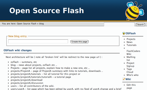
A new look for the OSFlash Wiki
NikO just implemented a new look for the OSFlash Wiki that should hopefully make it much easier to use. It's a very clean look that's an evolution of the previous style. In place of the fixed-width layout we had before, NikO's new design is fluid. He's also lightened up the header and I personally love how minimalist it is now.
He's working on changing the architecture of the wiki too to make use of tags. You can read about the coming updates in the OSFlash Wiki Changes post on the new OSFlash Blog.


Comments
by Zeh on 2007-02-20 21:15:23
by [NikO] on 2007-02-21 08:55:41
by Shunjie on 2007-02-22 02:48:00
by Kai on 2007-02-22 12:06:52
by Daniel Spronk on 2007-02-27 18:51:12