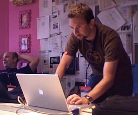
BarCampLondon: Andy Budd on Usability

User-centered design:
- Expert review
- Ask for opinions
- Test on real users
Just because something is easy to use, it doesn't have to be plain, dull, or boring. Some of the easiest products to use are also the best looking (e.g., iPod, Aeron chair).
Aral: I completely agree.
Other types of design:
- Aesthetic-centered design
- Implementation-centered design
- Business-centered design
- Politics-centered design
Andy is giving an example of airport signage design. He contrasts a traditional approach to this that involves a committee that decides where the signs should go based on their priorities with a user-centered approach that starts with the needs of the users.
Learn who is using your web-site and what their goals are.
e.g., Weather site goals
Assumption: Users are there to find the weather.
Reality:
Do I need to bring an umbrella? Should I pack for my holiday? Should I walk or take the bus? Can we have a BBQ this weekend?
User-centered design techniques:
- Contextual enquiry
- Interviews and focus groups
- card sorting
- personas and user paths
- cognitive walkthroughs
- usability testing and review
User Experience Design
Providing users with the best experience possible.
Steve Krug: Don't make me think! Andy: Don't make me think I'm stupid. But do challenge and engage them.
Concept of flow. e.g., World of Warcraft -- sequence of microtasks (why is he looking at me as he mentions WoW?) :)
Delight: Make products that are a delight to use (e.g., Expose, or the VirtueDesktop desktop switching.) The thing he loves most about his new MacBook is the magsafe power adapter.
Great session, Andy!

Comments
by LEE on 2006-09-03 16:38:48
by aral on 2006-09-03 23:11:47
by LEE on 2006-09-04 00:10:52