
iPad 2: Fit For Real Work?
Following my talks at the LOGIN, The Big M, NSConference, and Tweakers.net Developer Summit last month, .net magazine asked if I'd like to be the subject of their Reader Q&A section in their next issue and answer questions sent in via Twitter on life, UX, mobile, and everything. I informed them that yes, I'd be delighted to, and this whole adventure eventually resulted in a lovely email from Tanya at .net magazine with the questions that were tweeted in.
(Welcome if you're reading this from the link in the .net article, by the way. I hope you enjoyed it.)
Fast forward to this morning when I decided to write my replies using only my new iPad 2 to see how it holds up to some — albeit lightweight — real-world use. As I do, I will be writing this post, also on my iPad, using the free WordPress app.
The first hurdle (or "even the best web apps still have an uphill struggle when it comes to competing with native user experiences")
The first thing I had to do was to locate Tanya's email and copy the questions from it to Pages. After this, I would pick the questions I wanted to answer, delete the others, and start entering my answers after each of the questions. An easy enough task. Or so you would think.
The first problem was the Mail app on iPad when used with a GMail account via IMAP: it is horrible at searching for existing messages that it hasn't downloaded (ones on the server). So I had to do what I usually have to do, which is to fire up the GMail site in Mobile Safari. This let me find the message but — get this — I couldn't select the whole thing. There was just no way I could make the message scroll while selecting. A basic usability failure if ever there was one. I finally had to resort to using Send To Dropbox to forward the email to Dropbox where, using the Dropbox iPad app, I could select the contents to paste into Pages.
Pages for iPad
For the most part, Pages for iPad worked like a charm. My only complaint is that the word count feature is so well hidden that I actually thought it didn't have one (and cooked up a quick app to scratch my own itch before finding it).
How's that for radical contextualization? WordPress app issues.
Writing this post in the WordPress app wasn't entirely hassle-free either.
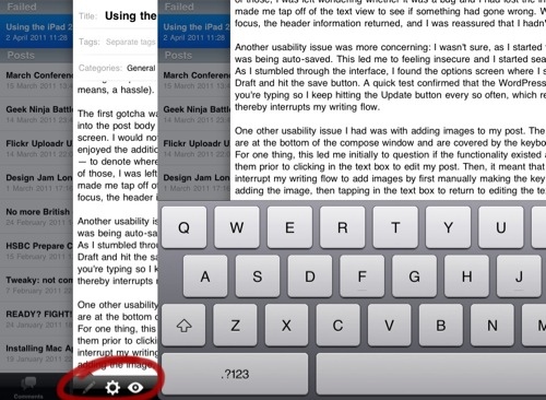
The first gotcha was a usability issue. When I started a new post, after entering the title, I tapped into the post body section and the header information entirely disappeared off the top of the screen. I would not have had a problem with that interaction — and, in fact, would have quite enjoyed the additional writing space it provided — if it had provided me with a cue — a landmark — to denote where the information went and a means by which I could get it back. Without either of those, I was left wondering whether it was a bug and I had lost the information altogether. It made me tap off of the text view to see if something had gone wrong. When the text view lost focus, the header information returned, and I was reassured that I hadn't lost it.
Another usability issue was more concerning: I wasn't sure, as I started typing my post, whether it was being auto-saved. This led me to feeling insecure and I started searching for a way to save. As I stumbled through the interface, I found the options screen where I set the status of the post to Draft and hit the save button. A quick test confirmed that the WordPress app doesn't auto-save as you're typing so I keep hitting the Update button every so often, which removes the editor and thereby interrupts my writing flow.
I would implement quite a rigorous auto-save since there's nothing worse than losing data (and it's an operating system expectation on iOS).
Adding images to my blog post
One other usability issue I had was with adding images to my post. The buttons for adding images are at the bottom of the compose window and are covered by the keyboard when you are typing. For one thing, this led me initially to question if the functionality existed at all since I hadn't noticed them prior to clicking in the text box to edit my post. Then, it meant that I had to once more interrupt my writing flow to add images by first manually making the keyboard lose focus, then adding the image, then tapping in the text box to return to editing the text.
Once I realised where to find and how to use the buttons, I was unimpressed by the functionality. It adds some horrible code either above or below your content (instead of where you are in the document).
I would redesign the interface so that the toolbar buttons were in a keyboard extension and so the writing area filled up the entire remaining space above the keyboard in both orientations.
Also, while taking screenshots on my iPad was simple enough (if a bit unergonomic due to the distance between the two buttons that have to be pressed in tandem), I found the simple task of annotating and cropping them to be a big issue. To cut a long story of several fruitless app purchases short, I ended up using the free PhotoPad app which was one of the few I could find that actually showed me the exact image dimensions I was cropping to.
A general UX gripe with the iPad: Undo
Shake to undo works like a charm on the iPhone. This is a tiny device that fits into the palm of one hand. Shaking it involves almost no effort at all and is an ergonomically-sound gesture. Not so with the iPad.
The iPad is the size of about six iPhone 4 placed side-by-side and thus has very different human factors considerations. Lifting this baby off your lap and shaking it wildly from side to side every time you want to undo a typo will, at best, make you look mentally unstable if carried out in a public space.
Apple must implement a better gesture for this important gesture in future versions of iOS for the iPad. I recommend a three-finger swipe to the left (with a three-finger right swipe as redo). It's currently not mapped to any universal gesture on the OS and is relatively effortless to perform and can be layered in as an alternative gesture while still supporting shake-to-undo to transition iPhone users to the iPad.
Since writing this, I've been alerted on Twitter that there is an Undo button on the iPad's symbol/number keyboard but it's not ideal; hidden away like that. I've had an iPad since the beginning and I never noticed it.
Blogsy
I finally gave up on the WordPress app and I'm typing this in Blogsy. Goodness knows it has its own limitations (for example, the code and "WYSIWYG" views look identical initially, making it impossible to know which mode you're in) but it is still light years ahead of the official WordPress app and has lots of potential (or is at least a step in the right direction).
A land of opportunity
So, is the iPad 2 fit for "real work?" Depends. On the app, that is. And what you call work.
On the one hand, you have awesome apps like Garage Band, Pages, Keynote, and Dropbox that you can be really productive with. On the other, there are lots of half-baked apps out there that may have potential but are, quite frankly, rather limited in professional features.
It feels to me like most apps on the iPad have a long way to go before users can be as productive as they are with a Mac. Far from being a negative aspect, this means that there is lots of opportunity here (for app developers who grok UX) to create successful apps.
Comments
by João Saleiro on 2011-04-19 22:36:39
by Richard Leggett on 2011-04-19 23:04:52
by Sol on 2011-06-13 13:32:50