The 3 MiFi: 5 lights, 3 buttons, 0 clue? – A review

3mobilebuzz.com contacted me before my talk at WebDirections @media to see if I wanted to try out the Three MiFi unit and blog about my experiences (don't confuse this with the MiFi that's sold outside the UK, which is known as the Novatel Wireless Hotspot and is notoriously difficult to find here.) Having just lost the T-Mobile USB dongle that had served me well for the last two years or so, I decided to take them up on the offer.
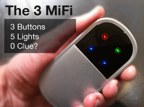
If you haven't had the chance to see or play with a MiFi, it's a portable WiFi hotspot that takes a SIM card and shares your mobile connection with up to 5 devices. It has a brushed-aluminium-and-white-plastic case that resembles a metallic version of Eva from Wall-E. The user interface consists of three little buttons on the side and a screen with five colored icons.
At this point, you may be wondering why a device that has just one purpose needs three buttons and five icons to perform its duties. The answer, of course, is that it doesn't. The UI is the worst part of the package and it leads to a rather frustrating user experience with the MiFi in general. I can only assume that the unit was designed either by committee or by graphic designers, not product or experience designers.
One button to rule them all

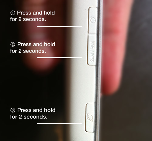
As I previously mentioned, the MiFi unit has just one function: to connect to your mobile account with Three and share that connection, via WiFi, with up to five devices. To achieve this, however, the MiFi asks you to press and hold three different buttons: one to power up the unit, one to initiate the mobile connection, and one to create the WiFi network.
This is a perfect example of needlessly exposing the inner complexity of the device to the user.
It's also a perfect example of what happens when engineers and designers worry about solving their own problems first, not the user's problems ("inside-out design" vs. "outside-in design").
Basically, if Google was a MiFi, it would give you a map of its servers and ask you how you'd like to load balance the search you're about to perform. The MiFi is a one-trick pony that needs nothing more than a single "on" button that turns it on, sets up the WiFi network, and connects to the Internet. In other words, it should "just work". Or, as Steve Krug puts it, don't make me think!
Colour me unimpressed

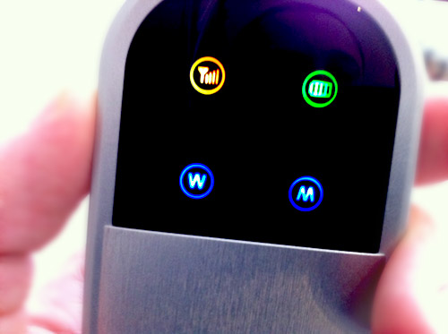
Once you've mastered the black magic of which order to press the three buttons in and finally managed to turn the device on, you're tasked with making sense of the five icons you're presented with on screen. In another design faux-pas, the icons both create expectations they don't meet and use colour as their sole semantic differentiator.
There is a static signal strength indicator which looks like a signal strength indicator but, being static, actually does not use the bars to indicate signal strength. Instead, it uses colour. (I'm not making this up.) If the signal strength indicator is red, you have low signal, if it's orange, you have a medium-level of signal, and if it's green, you have good signal. Of course, this is exactly what the bars in a signal strength indicator are for.
Similarly, the battery indicator, connection speed, and WiFi indicators display their status based on colour alone. There's also an "R" icon that apparently comes on when you're roaming (and blinks alongside all the other lights when you first turn it on).
Gutsy

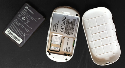
Another gripe I have with the unit is the location of the SIM card. Following the Nokia convention, the SIM card is located under the battery on the underside of the unit. This requires users to take the unit apart, remove the battery, and insert the sim card as part of their initial experience with the device. This is akin to going on a first date with someone and showing them the granny knickers you happen to be wearing. Why ruin the magic at "hello?" I don't want to see what the inside of my MiFi looks like. I want to insert my SIM card and be wowed by the magic of a data connection that I can share with up to four of my friends.
As far as actual operational functionality went, I didn't have any issues with the MiFi or 3's network. I was able to get a good signal in most places I went to in London and Brighton and when I couldn't, I couldn't. C'est la vie when it comes to mobile Internet these days with any network. The user interface issues, however, tainted the experience for me.
That said, the MiFi is a great idea and, even with its faults, it's a seductive financial alternative to purchasing different data plans for your laptop, iPad, and the plethora of other mobile gadgets in your geeky arsenal. With a single data plan and a single device, you can connect up to five devices or share your Internet connection with up to four friends. That, in and of itself, makes the MiFi a no-brainer.
If Three addresses the usability issues, the MiFi also has the potential to become a lovely experience. And it appears that they have begun to do just that with the recently-released MiFi 2.
MiFi: the sequel
I just read a review of the MiFi 2 by Ian Better that states that the MiFi 2 addresses some of the issues I outlined above. According to Ian, the new MiFi features a single "on" button. That's great news. Also, you can apparently now configure your MiFi via a web interface (this should make those of us on Macs and Linux PCs happy). Finally, the screen apparently now displays proper signal strength and battery information.
However, based on the photo of the MiFi 2 posted on Technovia and Ian's article, I still think there's room for improvement in the design. It looks over-engineered and the interface has way too much noise.
So, in my next post, I am going to design my version of the MiFi. Stay tuned for my MiFi 3 Prototype…

Comments
by Aral on 2010-07-13 07:49:28
by supertino on 2010-07-11 14:51:08
by Michel on 2010-07-16 11:46:43
by Tink on 2010-07-05 13:42:29
by Scott Jordan on 2010-07-06 06:08:41
by Supertino on 2010-07-06 16:16:59
by marcusjpotter on 2010-07-17 05:32:40
by Stephen Allred on 2010-07-19 22:03:59
by Ian on 2010-07-05 22:31:44
by Aral on 2010-07-06 10:05:34
by Aral on 2010-07-07 11:27:18
by Ben Collier on 2010-07-07 17:18:55