"Forgot password" UI Pattern
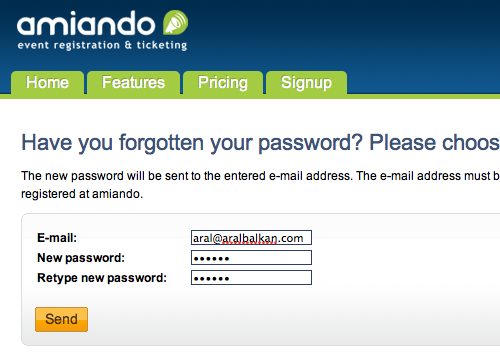
I just stumbled on the best "forgot password" implementation I've seen on event registration site Amiando.
You've no doubt seen various implementations of this UI pattern: all of these rely on using your email address to verify that you are indeed the user requesting the password reminder (or reset). But – as with everything else in UX – the devil's in the details (it's about The Little Things), as they say.
I keep coming up against two implementations that seem to have become de-facto standards:
- Create a random password, email it to the user, and then get them to confirm the password reset via email. Although not a horrible approach, it has two shortcomings. For one thing, you're creating a random password (that the user will forget if she doesn't change it – which requires yet more effort) and you are emailing the password to the user (which is insecure).
- Get the user to click a link in the email that takes them to your site and ask the user to enter a new password. This is better than the first method since the user will be entering their own password, which they will (hopefully) remember easier than a random one.
Amiando's form, however, implements a subtle evolution on the second method that makes the process even easier: on the initial form, they ask you for the new password. It's a simple little thing but it does mean that they've grouped the bit that requires cognitive load in one place. Now, all I have to do is click the link in the email to confirm my request and I'm up and running with my new password. It also means that the confirmation link has a single function and that its meaning is not overloaded to mean "confirm this request and then go on the site to pick a new password".
A few caveats
The Amiando implementation does fall flat on two important details however:
Firstly, it doesn't remember your email address. Since you've already entered your email address while trying to sign in, the forgotten password form should remember that email address to save you effort. I've seen this error made by nearly every forgotten password form I've encountered, so other developers should take note. It's not a difficult refinement to implement and it will result in an instant usability boost for your app (especially at a time when the user, not being able to sign in, is already frustrated).
Secondly, when you click on the link to confirm your new username and password, the site doesn't sign in you in automatically. Since it has confirmed your identity at this point and knows that you were trying to sign in, it should take the initiative and save you some effort.
(One of the worst implementations of this pattern that I saw actually changed your password without confirmation and then sent you an email with the new password. What a nightmare! Using that system, anyone could force a password change on your account on a daily basis, thereby forcing you to sign in and change your password back and probably driving you insane in the process.)


Comments
by Connor on 2010-06-28 13:32:59
by Hamish on 2010-06-14 20:21:18
by peter on 2010-07-06 23:04:06
by Connor on 2010-06-28 13:30:39
by James on 2010-06-14 11:59:57
by Aral on 2010-06-14 10:54:15
by Armin Bauer on 2010-06-14 10:26:27
by axel on 2010-06-15 22:07:52
by Richard on 2010-06-14 13:37:10
by Richard on 2010-06-14 13:39:04
by BobbyH on 2010-06-15 23:18:11
by Bryan Rice on 2010-07-19 18:54:58
by Yanay Zohar on 2010-07-01 14:41:59
by Prakash on 2010-08-09 18:23:15
by Charles Waggoner on 2011-08-26 19:22:30
by Jason Judge on 2011-10-26 17:04:13
by Frank Gebhardt on 2012-03-06 18:11:26
by hanis on 2012-09-01 09:02:46
by Anton on 2012-12-25 09:08:10