Opal UI Case Study Part II: Design Decisions and Emerging Usability Design Patterns
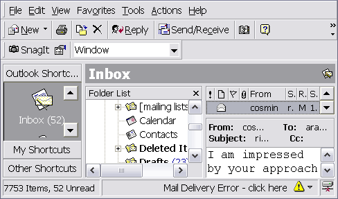
Telrock's original design brief stated that Opal should be "Outlook for SMS". That it should look and behave like Outlook in every way. This was, of course, a reflection of Opal's target audience: enterprise users who are already familiar with Outlook for email.
Although I could understand the business need behind wanting to emulate it, I was worried that Outlook's multi-pane interface was overly complicated for the modest requirements of SMS. It was important to notice that Email and SMS are very different mediums. Although emails can run into the thousands of words and contain complex attachments, SMS messages are limited to 160 characters. We also had strict limits on screen real-estate: Opal had to display on 800x600 screens and re-layout as would a desktop application when scaled. I knew that there would be several factors that would affect the usability of the whole application.

Emerging Usability Patterns
Talk One Language
There should only ever be a single term or phrase used to refer to any given item in the application. An item here may refer to a concept, a business function or task or even a widget or individual interface element. You will find that the use of a metaphor for the project, as advocated by XP, will ease this task tremendously.Respect User Effort
Try to limit the user's physical toil while using the application. Scrolling while viewing messages must be kept to a minimum or obliterated altogether.
Let The User Work
Users must be able to perform their most frequent, most important tasks without any resistance. For an SMS Messaging app this would include reading, replying to and forwarding messages and quickly checking the various mailboxes.
Prevent, Don't Scold
Whenever possible the UI should prevent the user from making a mistake instead of alerting the user to the mistake after the fact. This must be achieved without the UI getting in the way of the user.
Give Sufficient Feedback
The UI should give the user sufficient feedback for users actions. (This ties in nicely with Steve Krugs "Don't Make Me Think" philosophy: The user should never have to think "did that work?") Related to Don't Lose The User, see below.
Show, Don't Tell
Although this may seem to contradict with the Give Sufficient Feedback pattern, it is rather meant to compliment it. Whenever possible, meaningful visual cues (when appropriate to the audience) should be chosen instead of lengthy textual descriptions. This can also pertain to actually teaching a user to do something in an application by showing them.
Don't Lose The User
The UI should protect the user's sense of spatial positioning. The user should never feel "lost" within the application.Don't Sell What You Can't Deliver
Users must not be given Graphical User Interface (GUI) expectations that cannot be met (or can only be partially met) within a Web User Interface (WUI). Whenever OS or GUI expectations are set, they must be fully met. That said, the application must try and meet OS expectations as much as possible, especially for ergonomic features such as keyboard shortcuts and navigation but also for expected auxiliary helpers such as tooltips.
Don't Keep Them Waiting
The application must perform fast enough to be considered usable within the given engineering limits for the application.
As you can see, these are general points of advice that can apply to any application and yet have been presented here at times with specific relevance to the Opal problem domain. Based on these overall guidelines, the following are examples of high-level design decisions that were taken and applied in Opal.Patterns Applied: Examples from Opal

Respect User Effort: Eliminating Scrolling
The message preview textbox was created so as to display a full SMS message without scrolling. Although this meant that we had to be frugal with the other form elements we placed on the Message Tabs, it was more important for users to not have to scroll to read an SMS message.
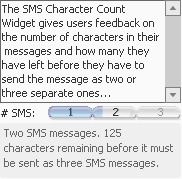
Give Sufficient Feedback: SMS Character Count
We created a custom SMS character count widget to show users exactly how many characters they had left before they would need to send a message as two SMSs and then three SMSs. This was an especially important piece of information for users as they would be charged by SMS message sent.
Prevent Don't Scold: Form Validations
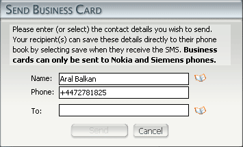
All forms in Opal implement client-side validation. Submit buttons (such as "Send Message" or "Add Contact") gray out until the form has passed client-side validation. Of course, Ali and Steven made sure that all forms are validated server-side for correctness and security before being processed. Client-side validation in no way negates the requirement for server-side validation. The two have entirely dissimilar goals. Client-side validation exists solely to improve the user experience.
Let The User Work: Mailbox Tabs and Message Action Tabs
 A composite tab-based interface was designed to expose the critical, most frequent tasks of users. The mailbox tabs allow users single click access to their mailboxes while, at the same time, exposing the mailbox-sensitive message actions. Thus, users are immediately able to see the context-sensitive actions they can perform on a message in a given mailbox tab. On the other end of the usability scale would have been an implementation of a context-senstive menu for messages that would hide the possible actions until triggered (according to usability studies, most beginner/intermediate users do not use context-senstive menus.)
Show, Don't Tell: Menu Bar and Tool Bar as teaching methods for migrating Outlook Users.
 To provide a migration path for Outlook users, while at the same time trying to meet OS expectations, we implemented a menu bar and tool bar reminiscent of the ones in Outlook. If these simply performed the expected actions, Outlook users may have been expected to rely on using them for their everyday work. This would not be an optimum use of Opal, however, as the menu especially adds a level of complication to frequently performed tasks (users have to open a menu to select an action). Instead, the menu and tool bars were implemented to Show, Don't Tell. When an Outlook user first changes to a given mailbox using the menu or tool bar, the Mailbox tab animates to the chosen mail box, thereby showing the user that they could also have clicked on the tab (although the tab control is a well-known GUI component in its own right.) The same goes for when the user selects a Message Action (eg. Reply). Using this system, Outlook users can very quickly adapt to the efficient way of using Opal through the tab interface (and this, without being told how to!)
Don't Lose The User and Don't Sell What You Can't Deliver: Screen-based RIAs vs. Multiple-Window-based RIAs.
 It is very important to note the differences between Graphical User Interfaces (as used by desktop applications such as Outlook) and Web User Interfaces (as used by Rich Internet Applications such as Opal). It is equally important to manage client's expectations as to the limitations of Web User Interfaces, even those termed "Rich" and developed using Flash.
The greatest difference between a WUI and a GUI is usually the most overlooked: WUI applications run from within a GUI application which, in turn, runs inside a window-based operating system. Past usability studies have shown that especially beginning users have problems with the concept of multiple windows, preferring usually to keep a single window up at a time. Even in multitasking operating systems like Windows XP or OS X, novice users sometimes prefer to start up a single application, shut it down and start another application and so on. The perceived complexity of the system is heightened when the user is confronted with an interface (an RIA such as Opal) within a GUI application (the web browser) that itself contains windows.
Firstly, we rob our novice user of the comforts of his single window existence. Secondly, the new windowing system works in a different way and contains its own rules and limits. It is thus important to implement a screen-based interface in RIAs so that you Don't Lose The User and Don't Sell What You Can't Deliver.
Even if an RIA developer takes pains to develop a Multi-Window Interface that mimics a certain dominant OS, the interface is still being presented to the user in the document area of a GUI application (the web browser). This is contrary to OS expectations wherein users expect not to see windows within documents. Perhaps this is one area where application browsers such as Central will have an impact on user expectations. It remains, however, that the only way a multi-window interface can provide a high-level of usability in an RIA is if the application can run in its own OS window and not as a document within a web browser and thus access the windowing abilities of whatever OS it happens to be running on. As this is currently not a possibility with Flash, we decided to go with a screen-based system in Opal.
Although modal pop-ups are sparingly used due to issues of screen real-estate and Outlook migration expectations, users are visually shown that these dialog boxes are modal screens via the graying out of lower screens. Although this removes the OS expectations surrounding non-modal multiple-window interfaces, the graphic similarity of the dialog screens to windows has led certain users in testing to attempt to move windows around. This may thus be a feature that we implement in the second release so as to adhere to Don't Sell What You Can't Deliver.
Don't Keep Them Waiting: The name of the game is performance.
If there was one issue we kept running into during development of Opal, it was performance. It is no secret that Flash is not the fastest kid on the block and it is possible to run into issues when client's expectations are not managed as to the limitations of RIAs. Although RIAs can recreate a lot of the desktop application experience from within a web application, there are limits.
 One issue we ran into, for example, was that the speed of the setSize method on the Macromedia DRK Data Grid was resulting in unacceptable redraw times when the application was resized. This resulted in a very risky two-weeks in which I wrote a completely new Data Grid component that implemented the DRK Data Grid interface and could be plug-and-play replaced into application. The resulting Data Grid offered a 10x performance boost and brought redraw rates back within acceptable limits.
![]() What about the risk and additional cost introduced into development? Would those two weeks have turned into four, six, or possibly a buggy implementation of a core component that could have plagued Opal's existence had I not had extensive experience in creating similar components for the K12 Online School? Should competent application developers be expected to also be proficient component developers? I will try and tackle these questions in the next installment in this series: Dances with Components, wherein will be told the story of the Opal Data Grid, Opal Menu and the Exciting Tale of the Many Components That Were Optimized, Extended and/or Decorated.
What about the risk and additional cost introduced into development? Would those two weeks have turned into four, six, or possibly a buggy implementation of a core component that could have plagued Opal's existence had I not had extensive experience in creating similar components for the K12 Online School? Should competent application developers be expected to also be proficient component developers? I will try and tackle these questions in the next installment in this series: Dances with Components, wherein will be told the story of the Opal Data Grid, Opal Menu and the Exciting Tale of the Many Components That Were Optimized, Extended and/or Decorated.

Comments
Part II: Design Decisions and Emerging Usab [...]
by onRelease() :: Launched Opal UI case study series on 2003-12-19 16:47:11
by onRelease() :: The Danger with TinyURL on 2004-01-07 16:03:33
by Flash Ant: The Rich Internet Application Blog. :: On using OS-styled themes in Web Applications (or "In support of Halo") on 2004-02-11 07:06:39