Pop!_OS 18.04: the state of the art in GNU/Linux on desktop

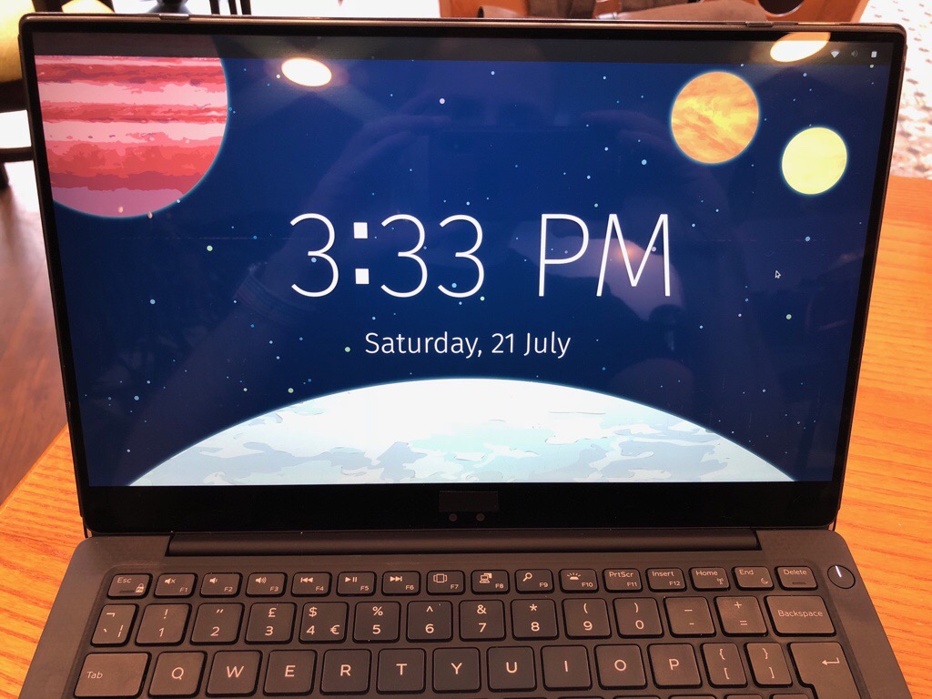
Pop!_OS is beautiful, thanks in no small part to a consistent minimalist visual style and Kate Hazen’s beautiful space-themed illustrations.
Pop!_OS 18.04 is a GNU/Linux distribution curated by US-based computer maker System76. It is the state of the art in usability and experience when it comes to desktop Linux today1.
The genius of the System76 team was in realising that all the components for a usable, convenient, and delightful GNU/Linux desktop experience are already here, they’re just not tastefully curated. They took the best bits of the Linux ecosystem, added some of their own special sauce, and ended up creating a minimal, coherent, consistent and – at times – delightful experience.
Take note, because this is a inflection point in desktop Linux.
If you had asked me a few years ago, these are not words I thought I would ever be using to describe a Linux distribution. And they’re not just words. I recently switched my main development machine from a Macbook to a notebook running Pop!_OS after falling in love with it in a virtual machine.
The ingredients of success
A number of core elements constitute the Pop!_OS experience.
The main ones are Ubuntu 18.04 LTS, Gnome 3 with Gnome Shell, a unified theme that uses material design, consistent keyboard shortcuts, an adapted version of the elementaryOS AppCenter, and a minimal set of default apps.
You combine these elements with a formal approach focussed on creating a simple experience for a specific target audience and you get Pop!_OS.
We’re building an OS for the software developer, maker, and computer science professional who uses their computer as a tool to discover and create. – System76
I will be exploring the various aspects of the design in detail in future posts. Suffice to say for now that Pop!_OS offers a more minimalist – and definitely less corporate – experience than macOS without attempting to recreate it. A huge amount of the kudos for that goes to Gnome 3 and Gnome Shell.
Gnome Shell 3: A masterpiece in interface design
Gnome 3 and Gnome Shell should be case studies in great interaction design2.
Instead of copying Windows or macOS (an affliction that affects other alternatives and is inexplicably seen as a feature in those communities), Gnome 3 has its own culture and consistencies. These clearly derive from a first-principles approach to design and are refreshing to behold.
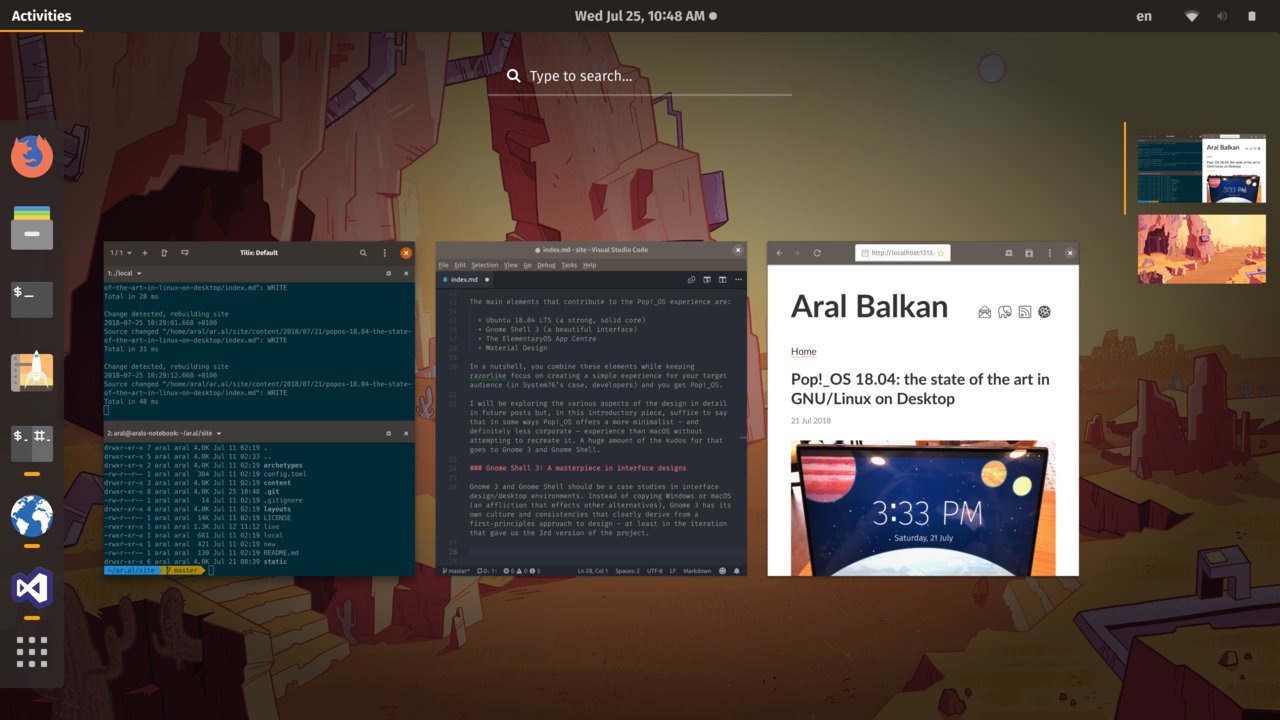
Much of the simplicity of Gnome 3 comes from the conceptual unity provided by the Activities view. A single key (the super key), takes you to this view where you can see all of your current apps as well as search for anything on the system or the store from a single place.

The Activities view in Gnome 3 beats Windows and macOS on simplicity.
Unlike Windows, there is no ungainly multi-level start menu from hell. Unlike macOS, the task of finding things is encapsulated in a single place instead of being split among two different features (Mission Control and Spotlight). If you are looking for something, there is one place to go. I know that I can get to anything I want using the Activities button or pressing the super key. This is as low as you can get in terms of cognitive load and is an absolute joy to use. It’s the state of the art in operating system navigation interfaces bar none. It’s as good as it gets.
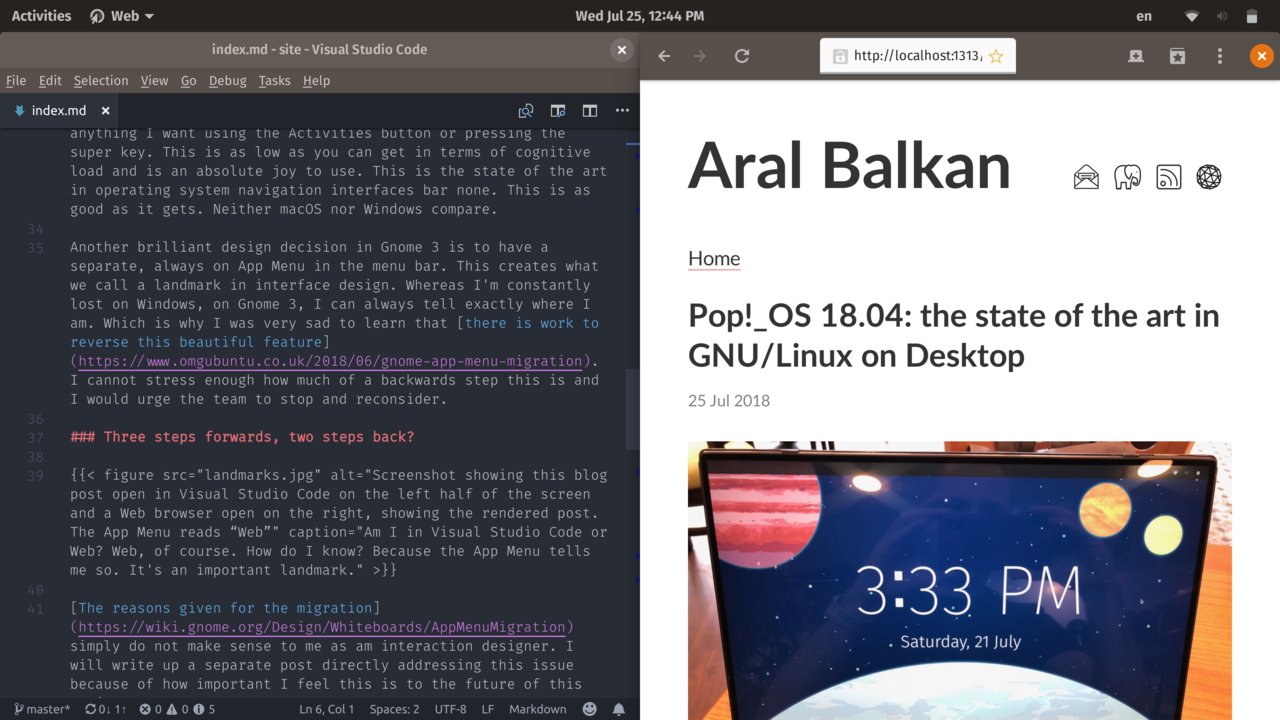
Another brilliant design decision in Gnome 3 is to have a separate, always on App Menu in the menu bar. This creates what we call a landmark in interface design. Whereas I’m constantly lost on Windows, on Gnome 3, I can always tell exactly where I am. Which is why I was very sad to learn that there is work to reverse this beautiful feature. I cannot stress enough how much of a backwards step this is. It breaks the conceptual integrity of the design. I would strongly urge the Gnome team to stop and reconsider this pending – yet still avoidable – regression.

Am I in Visual Studio Code or Web? Web, of course. How do I know? Because the App Menu tells me so. It’s a crucial landmark.
Three steps forwards, two steps back?
The reasons given for removing the App Menu simply do not make sense to me as an interaction designer. Having the App Menu separate from app windows is the conceptually-correct, properly-encapsulated grouping of elements and serves as a crucial landmark to designate the currently-active application and the actions that can be performed on it.
Given how important I feel this decision is to the future of the platform that I now use myself, I want to take a moment to refute each one of the justifications given for removing the App Menu from Gnome 3:
It’s disconnected from the app window
Yes, of course.
That’s because it is the App Menu, not a window menu. The actions within the App Menu affect the app, not the windows (notice the plural form) that may exist within the app. If desktop apps always had only a single window, then the statement would be true. As things stand, it is not.
It doesn’t make sense with multiple monitors
Yes, it does.
Having multiple monitors doesn’t remove the need to know which app you’re in or to perform actions specific to that app. Just like the Activities button, the App Menu resides at a known location on your primary monitor and serves a crucial role as a landmark.
No other platform has this pattern
This is correct as long as you don’t consider macOS a platform.
The distinction between app-level and view-level menu items can be murky
This is only true for apps that do not properly conform to the Gnome Human Interface Guidelines (GHIG3)
There is no murkiness in the conceptual separation between an app and its windows. That’s a basic concept in desktop interface design. An app contains one or more windows. Actions that affect the app reside in the App Menu and actions that affect specific windows reside in the window menus of those windows.
It’s only accessible for the app which currently has focus
Yes, that’s the whole idea!
Unless you’re a dual-mouse wielding multitasking wizard (in which case, an operating system hasn’t been written for you yet), you can only interact with one app at a time. The reason the App Menu is a landmark is because it shows you which app currently has focus and encapsulates the actions you can perform on that app. This is not a problem, it is one of the main reasons why the feature exists in the first place.
Our own apps use it inconsistently
This is a great reason to get our own apps to use it consistently, not to formalise the inconsistency by breaking an otherwise consistent conceptual model. There’s a difference between paving the cow paths and framing cow shit.
Third-party apps have not widely adopted it, so it mostly sits there empty
Same point as above and my response is the same: we should expend effort on getting third parties to adhere to the human interface guidelines (HIG) instead of breaking the conceptual integrity of the platform to cater to nonconforming applications. If the HIG is not clear enough, let’s update the HIG.
Some new users don’t seem to find it, and e.g., assume that there are no preferences
It is normal for people who start interacting with a new thing to not know how the thing works. The better the affordances of that thing, the easier they will learn. This is also where landmarks play an important role. The problem isn’t that the App Menu isn’t a strong landmark or that it doesn’t provide a strong affordance but that it is inconsistently applied by apps.
The rest of the proposal goes on to conflate a desktop interface model (multiple windows) with a mobile interface model (single screen). A single menu makes sense on the mobile interface model because that is screen based, not window based. In the screen-based model, the app menu is the screen menu. It does not follow, however, that this then also makes sense in a window-based model where we have a clear separation of an app and its windows.
The only real problem with the App Menu is that some apps don’t use it in conformance with the human interface guidelines. So the only real problem with the App Menu isn’t a problem with the App Menu at all but with developers violating the human interface guidelines and a failing on part of the platform itself to attempt to adequately enforce its human interface guidelines.
Likewise, the only intellectually-honest reason I can see for removing the App Menu from Gnome 3 is “we want it to work more like Windows.” That’s the worst-possible reason I can think of for breaking the conceptual unity of an otherwise beautiful design.
On consistency
There is a very real problem in the GNU/Linux ecosystem but it’s not the App Menu in Gnome 3. The problem is lack of consistency. Or maybe, more precisely, a culture that celebrates lack of consistency as a feature, confusing it with “choice”.
Beautiful, consistent defaults are not mutually exclusive with choice. Choice is about having the option of diverging from the defaults, not whether or not those defaults mandate a certain cultural cohesion or consistency.
Gnome should not be ashamed of its culture. On the contrary, it should be working to implement it as consistently as possible in its ecosystem. So let’s get Gnome apps to use the App Menu consistently instead of removing it. Let’s improve the consistency of the platform instead of destroying a valuable landmark and violating the conceptual integrity of the design.
The lack of a strong, coherent culture for applications is the last thing holding desktop Linux back.
As evidenced by Pop!_OS, it’s entirely possible to build a Linux distribution that can challenge the flagships of multibillion-dollar behemoths like Apple and Microsoft. The bit where the experience falls flat is the moment you install an app that doesn’t respect the culture of the platform. Using a KDE app on a Gnome desktop is like following a recipe for a cake in imperial measurements when your country uses the metric system. At best, you increase the cognitive load of baking a cake and at worst you end up with an inedible mess.
This is the biggest challenge both for innovative organisations like Purism and System76 who are making progress towards controlling the whole free and open stack, and thus the whole experience. They are competing with the meticulously-crafted and (like it or not) consistent cultures of platforms like macOS.
Imagine if every macOS app looked and behaved differently. Imagine if some third-party could arbitrarily decide to make menus in macOS work more like the menus in Windows 10 in the next release. Apple wouldn’t be where it is today. And yet that’s exactly the situation Purism and System76 find themselves in today because they both use Gnome 3.
If GNU/Linux is going to compete with the likes of Apple, we must start to value consistency, not despise it. And we must not be afraid to create and enforce strong, consistent cultures for our platforms.
-
Instead of merely going on my gut instinct and over three decades of experience in living and breathing technology, I wanted to make sure I tried a wide gamut of what’s currently available so, before writing this I tried the following distributions: Ubuntu 18.04, elementaryOS, Kubuntu, Mint, Nitrux, Solus, Deepin, Feren, and PureOS. The distribution that comes closest to Pop!_OS right now is PureOS. I also have notebooks running the latest Windows 10 and macOS. ↩︎
-
That’s not to say that it is perfect (nothing is), but that there is tremendous potential here. As I write this footnote, for example, my external trackpad (an Apple Magic Trackpad) isn’t working because the bluetooth adapter didn’t survive waking from sleep. The other day it was the WiFi. On the same trackpad, when I click, the mouse cursor jumps, giving me the electronic equivalent shaky hands. These are the sorts of issues that we must triage to high priority. They’re not as easy to fix or sexy to work on as moving things around in an interface. But they constitute the core of an experience and make all the difference in empowering people when they work well and enfeebling them when they don’t. For a great example of work in this area, see (and support, if you can) William B. Harding’s effort to improve the experience of touchpads under Linux. ↩︎
-
Which I’ll henceforth be pronouncing as “gig”, because why not? ↩︎