
How not to design a menu
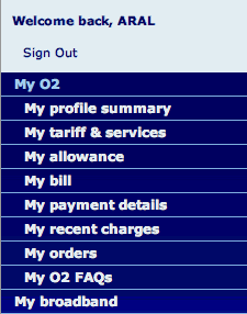
I just got a 3G iPhone and signed in to the O2 website to take a peek at my account, only to be greeted by the menu you see here.
My, my, my..! :)
It's completely unscannable, with each line starting with the same prefix ("My"). As I try to scan it, my brain initially refuses to think that they're separate menu items. It runs contrary to my natural ability to distinguish patterns by homogenizing the visual appearance of each item.
Simply removing the "My" prefixes alone is a big step forward. That, and removing O2 from "O2 FAQs", leaves us with a much more scannable list:
My O2
- Profile summary
- Tariff & services
- Allowance
- Bill
- Payment details
- Recent charges
- Orders
- FAQs
Much less cognitive effort, much easier to scan.
They could have avoided this menu mishap completely if they'd read through Robert Hoekman, Jr.'s excellent new book, Designing the Moment. (And, yes, I'm very psyched that Robert's going to be speaking at Singularity!)
Comments
by Iain on 2008-07-11 17:10:23
by Lee McColl Sylvester on 2008-07-11 16:23:35
by iheni on 2008-07-11 16:02:22
by Aral on 2008-07-11 17:41:32
by creacog on 2008-07-11 15:55:39
by Dan on 2008-07-11 16:39:13
by borzoj on 2008-07-11 21:31:50
by Farid Abdulhadi on 2008-07-12 06:35:47
by Robert Hoekman, Jr. on 2008-07-11 17:45:17